When it comes to typography, baybayin is still uncharted territory.
Standardization is needed for modern baybayin. However, "Modern" does not mean "bastardizing" the script by adding new characters or modifying existing ones without precise & careful comparative consideration to tangential scripts; (Brahmic/Indic) origin, (Malay/Kavi) related, (Mangyan/Tagbanua) living, and (cataloged/printed) historic. I find that breaking down each baybayin character or glyph to its most basic strokes and forms helps in understanding these origins and relationships.
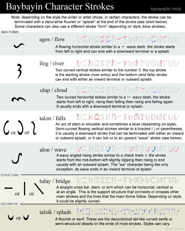
I have broken down character elements and divided/grouped them by their consistent forms of strokes. Since there are currently no official terminology specific for baybayin typography, I went ahead and labeled them using a naming convention that would be familiar to almost every Filipino. See table/graphic below:

There are 5 main forms, each form is an individually stylized stroke or series of simple strokes. These forms are supported by one or two structural & decorative elements. The structural element determines the direction of the main form (horizontal, vertical, or angled).
These 5 forms and 2 support (structural & decorative) components are the most basic & consistent strokes of baybayin characters. These are based on all the samples (handwriting & print) found in books & manuscripts from 1600s up to the early 1900s and also compared with Brahmic/Indic, Malay, and our living scripts. I have been studying each individual baybayin & related script's characters and found every shape & form correlations. I will publish my findings for each and every letter/glyph and share a few of them with you here soon. The more precise info will be included in my book.
I love your blog. This is a really great endeavor. Blessings!
ReplyDeleteSalamat , natangkilik ko ginawa mo
ReplyDeleteAwesome work; thanks for this post.
ReplyDeleteI was just perusing the Telugu Script at AncientScripts.com (http://www.ancientscripts.com/telugu.html) and noticed some letter forms which appear related to Baybayin's forms -- both descending in parallel from parent forms, as it were.
In particular, notice O, BA, KA, DA (and RA, FA, and SHA, while you're at it), PA, GA, HA, MA, and NA.
For example, I can pick out the "agos" in Telugu's KA, MA, and RA. If other related scripts attest to this mark, then the "agos" mark may have two origins: one as a sort of character modifier, and one core structural member.
I don't mean to treat Telugu as a source for Baybayin, but rather to show that the relationship to other Brahmic scripts can help understand Baybayin's underlying structure.
I've posted a comparison of Baybayin with Kawi and modern Telugu here:
ReplyDeletehttp://rob-tyro.blogspot.com/2010/03/side-by-side-kavi-baybayin-and-telegu.html
That's a really interesting idea, working out a typographic analysis of Baybayin. Even for Arabic and Indic scripts, there's not much that has been done (as opposed to the old theory of calligraphic structure in Arabic) though there are beginnings. I wonder if there's something along these lines for southeast Asian scripts like Thai, Khmer or Burmese.
ReplyDeleteAnd the idea of basic strokes or complex strokes is important: you see this kind of thing recurring in many different scripts (the bowl and stem structure of many l.c. Latin alphabet letters, for example).
I think you're quite right about things like the "ilog" (which I call a squiggle or an oscillating stroke, based on the way the hand and wrist move to make it), or the "alon" (which I call a cup, though I don't include the tail in this). These are basic elements that can be put together in a number of ways to derive most of the letter shapes. And of course, the "agos". Though I tend to think of the "ulap" as just a horizontal variant of the "ilog". The oscillating strokes are a particularly Baybayin stroke type that you don't find elsewhere, but the "alon" and "agos" have clear counterparts as basic stroke types or sequences in Batak and South Sumatran scripts.
I'm curious that you didn't include the cross stroke though. Of course, it's not an element of the main body of letters, since it's added once the main body is drawn. Still, it seems to me to be a basic structural element of Baybayin letters: where you place it (left of the cup, across the counter of the cup or off the right branch of the cup) is the only thing that distinguishes ‹a›, ‹m› and ‹p› in most versions of these letters.
Another question: do you have particular thoughts about the stress angle and stroke modulation? I notice that is something that was introduced by Lopez in his fonts. It seems to me that for his Belarmino font, he basically took the Doctrina typeface and added a contemporary European-style modulation (based on the calligraphic trace of a nibbed pen on paper) and stress to the letters, and much of what has been done since emulates that. (He also went much farther in another font - I forget where that was published - and made a copperplate version of Baybayin with exaggerated thin upward swashes.)
Hi, Nordenx! You're doing a noble thing for our dying culture. Ginagamit ko na ngayon ang dalawa sa mga fonts mo; nasasabik ako sa mga susunod mong lilikhain. Napansin ko lang na wala kang quotation marks (""); maaari mo bang idagdag iyon?
ReplyDeleteMuch of the similarity between Baybayin and other south Indian scripts comes from the use of similar materials, as well as descending from a similarly cursive parent script.
ReplyDeleteIn south India, scripts were written on prepared palm leaves (from the Talipot palm) with a metal stylus. Long, straight and excessively angled strokes would tear the leaves, so the scripts became more cursive. After the letters were inscribed upon palm leaves, the leaves would be wiped with soot or ink to fill in the engraved lines. North Indian scripts on the other hand were written with ink on other materials as well as prepared palm leaves, which is why Devanagari has straight lines and a number of sharp angles.
Kawi, which is of course the parent script for Baybayin descends from the script of the Pallava dynasty, of which Telugu also descends. So, it holds that we'd see many similarities on writing both Telugu and Baybayin.
The check mark shaped head mark in Telugu comes from a previous serif that was seen as intrinsic to the alphabet. In Oriya it became a large curved "roof". In Devanagari it became the continuous head line. In Kannada, the straight line with curved end, and in Telugu, the check mark shaped line at the top.
Certainly, the curvilinear shape of the Baybayin letters is quite possibly due to its being written on palm leaves, though it's not clear that palm ("lontar") leaves as such were used in the Philippines (as opposed to other kinds of leaves). The early observers — which one(s) I don't recall — did say that the inhabitants of the islands wrote to each other on leaves and on bamboo. Even in Tagbanuwa script, as in the Batak scripts of North Sumatra and Lampung script in South Sumatra — which were also written on bamboo, letters have a curvilinear shape unlike the angular straight lines of Rejang and Mangyan bamboo scripts.
ReplyDeleteIt may be that the curvilinear shapes in Tagbanuwa and Doctrina Baybayin are due to their being directly derived from the palm leaf script of Sulawesi, whose characters have since simplified to sequences of minimalist rising and falling strokes plus dots. One thing that *does* point to a common origin for Baybayin, the Makassar-Bugis script, and the scripts of north and south Sumatra, is the way their main letter strokes are overall slightly rising off the horizontal. This is very different from the verticality of Kawi and its two unequivocal daughter scripts (Sundanese and Javanese-Balinese).
The theory of a Kawi origin for all Indic scripts of Indonesia and the Philippines (not only those of Java, Bali, Lombok, and Adityawarman's Sumatran kingdom) originates in Hendrik Kern's (1882) article "Over de opschriften uit Koetei in verband met de de geschiedenis van het schrift in den Indischen Archipel". Numerous other origin theories have been proposed before and since for Baybayin and the other similar scripts (early pre-Nagari script, early Cham scripts, a common origin in South Sumatran scripts whose own origin is unknown, to name just the most plausible ones) but Kern's is the one that for whatever reason has become the most widely known and quoted. However, his arguments are not overall superior to those found elsewhere — the steps in logic often depend on unspoken and undefended assumptions — and not one of the theories yet published has made a strong, systematic case for its hypothesis equivalent to what is expected of any theory of historical relationships between spoken languages.
The current consensus among specialists working with scripts of Sumatra and Sulawesi (the Philippines being less well represented) is that although there are affinities between these scripts and Kawi, the differences are too great for these scripts to have evolved from Kawi in the same time frame as the Javanese-Balinese scripts. They generally add that although Kawi may have some distant relationship to the "Sumatra-Sulawesi-Philippine" scripts, only the discovery of some as yet unknown inscription(s)/manuscript(s) is likely to provide evidence of how these scripts evolved from an earlier source (if Kawi it is).
Kiwehtin: Of course, I would speak before reading further evidence to the traditionally held theory that Baybayin comes from Kawi, but never the less, it's still a mystery as to the true origin. Although, I honestly would not be surprised if there *is* a link, although perhaps a highly simplified form.
ReplyDeleteAnyhoo, I'm not necessarily saying that the ancient Filipinos wrote on Talipot palm leaves (lontara),although the distribution of Corypha utan does extend into the Philippines.
To write on leaves, one needs something with strength to it. Most dicot leaves are rather easily torn no matter the stroke type, having "net vein" patterns rather than long, straight, strong fibres. The angular main veins would also interfere with writing.
The most uniform leaves without prominent veins would be those of monocots, whether some sort of palm (buri, nipa) or perhaps even pandan or something else. There have even been bamboo leaf manuscripts written in India.