Showing posts with label Strokes. Show all posts

Friday, August 14, 2020

Trace and Teach - educational font

I will be releasing an educational tracing font with starting positions and stroke arrows for kindergarten, beginners, teachers, workbooks, etc. SOON! (I know, often my "soon" turns out to be months or years or never. :P Please be patient.)

However, these fonts will not be free. I plan to release them as commercial fonts. I have been developing these of-and-on since 2003 and they have been a lot of work. Since creating these have been time and labor intensive, I want some return on investment. These fonts will be for sale.

Baybayin Modern Teacher fonts are TrueType fonts that assists young learners in printing Baybayin and Surat Mangyan letter shapes correctly and efficiently.  It provides lines containing dotted letters for students to trace with the starting position and stroke directions illustrated for each letter, and punctuation mark.  The fonts have been carefully developed to provide an intuitive, practical introduction to writing Baybayin and Surat Mangyan.

The fonts uses extended stroke direction arrows to discourage students from lifting their pencils between strokes unnecessarily so that students do not form disjointed letters. Learning correct stroke sequences improves penmanship and encourages students to get used to the cursive and wavy strokes of Baybayin.

Many students never learn correct penmanship because stroke sequences are seldom emphasized in the classroom during formative years. Then in later grades it is very difficult for teachers to correct poor writing habits that are already well encoded into students' procedural memory. Get it right the first time around with Baybayin Modern Teacher fonts!

Besides learning correct stroke sequences, teachers will find that the standardized, uniform, and simpler letter shapes of these fonts to be practical and easier for the students to learn. The typeface is a cleaner and simpler version of the Doctrina Christiana typeface. As always, I added of the set of alternative glyphs from my modern set and proposed reform. I added the modern RA and the kawi based JA, Mangyan pamudpod, x-kudlit, anusvāra, visarga, e/o kudlits, pallawa & padalaw-a marks, and other syllable-doubling marks; assigning them to the appropriate keys.

Baybayin Modern Teacher fonts works like other custom fonts. After you buy the font, you download the font file, and install it on your Mac or PC. Then you use whatever software (like Microsoft Word, Microsoft PowerPoint or other software like Interactive White Board (IWB) software) to create resources for your class, like tracing sheets or flash cards.

Examples:

https://drive.google.com/file/d/1fF1idxzcdkZIdMrmEhvKMYVvnIM9y0r6/view?usp=sharing


Tuesday, March 09, 2010

Breaking it down

Over the centuries, the western alphabet has been studied, measured, standardized, and its letter shapes broken down to its core components. Modern print even analyzed every stroke and flourish and given them names and terminology as well as cataloged them by style, form, and function.


When it comes to typography, baybayin is still uncharted territory.

Standardization is needed for modern baybayin. However, "Modern" does not mean "bastardizing" the script by adding new characters or modifying existing ones without precise & careful comparative consideration to tangential scripts; (Brahmic/Indic) origin, (Malay/Kavi) related, (Mangyan/Tagbanua) living, and (cataloged/printed) historic. I find that breaking down each baybayin character or glyph to its most basic strokes and forms helps in understanding these origins and relationships.

I have broken down character elements and divided/grouped them by their consistent forms of strokes. Since there are currently no official terminology specific for baybayin typography, I went ahead and labeled them using a naming convention that would be familiar to almost every Filipino. See table/graphic below:


There are 5 main forms, each form is an individually stylized stroke or series of simple strokes. These forms are supported by one or two structural & decorative elements. The structural element determines the direction of the main form (horizontal, vertical, or angled).

These 5 forms and 2 support (structural & decorative) components are the most basic & consistent strokes of baybayin characters. These are based on all the samples (handwriting & print) found in books & manuscripts from 1600s up to the early 1900s and also compared with Brahmic/Indic, Malay, and our living scripts. I have been studying each individual baybayin & related script's characters and found every shape & form correlations. I will publish my findings for each and every letter/glyph and share a few of them with you here soon. The more precise info will be included in my book.

Wednesday, September 27, 2006

Bagong Baybayin ~ Modern Script Fonts

The Script

Baybayin script is an ancient form of writing by native islanders and tribes in the South East Asian archipelago we now know as the Philippines. For a comprehensive detail about Baybayin, you can find almost everything there is to know about it from this site: Paul Morrow's Site


My History

My first acquaintance with Baybayin is through my father (John de los Santos) who taught me to read and write the script back in the early 1980's. I was in my teens back then and didn't know its significance, I just thought it was some cool form of shorthand. Later on in life, about a year or so after immigrating to the U.S. from the Philippines, I began soul searching and looking back into my heritage (maybe it was due to the fact that I was homesick). Thanks to the Internet and its vast resource of information, I eventually stumbled upon Paul Morrow's work on Baybayin. This sparked my renewed interest in the ancient script of my ancestors. I began incorporating the script into my projects such as artworks and even videogame development. Earlier this year, I started creating my own fonts based on my handwriting.

The Font

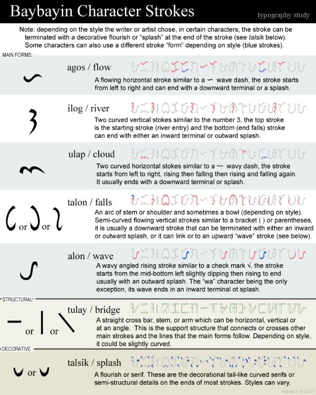
I came up with a set of four true type fonts (TTF) I called "Baybayin Modern". The fonts are stylized modern composite of many examples from the past but the style is based primarily on my calligraphy work and handwriting. Though stylized, these fonts are still based on the basic strokes of historic samples of the Baybayin. The font is calligraphic & artistic representations and the characters’ shapes, sizes and weights have been made uniform in order to present a neat and elegant printed appearance.

What is new?
D + P = R


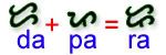
Besides style & dimensions, a couple of "new" features are introduced by my fonts; a major addition is the introduction of a character for the phonetic-syllable /ra/; since /da/ and /ra are originally represented by the same character ("DA") in the Filipino languages rendered by Baybayin (alternatively the "LA" character is sometimes used for /ra/ in borrowed foreign words rendered by Baybayin).

In my own handwriting, in order for me to recognize my /ra/ from my /da/, I add a marker to the "DA" character in order to differentiate the two. Coincidentally my "RA" character matches the features of the "PA" character therefore it seemingly creates a consistent flow not unlike the roman "P" and "R" letters.

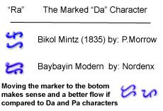
An instance of a separate character for "RA" can be found in Bikolano's version of the script. The Bikolanos have a unique way of writing Baybayin (Basahan) which includes a different way of writing the kudlits (kaholowan). Anyway, this is where some features of Baybayin Modern and my handwriting are based on (including kudlit orientation and of course the unique "RA" character).


If you're a purist, just don't use the "R" key and use the "D" key instead.

For more info in Bikolano Basahan, please refer to Paul Morrow's entry for the Bikol Mintz Font here: Morrow's Baybayin Fonts

Q, J, and X

Additionally, just like Paul Murrow's fonts, the phonetic and phoneme equivalents of the roman letters Q, J, and X have their own unique character keystroke. They are not new characters (unlike the failed method of the erroneously named Alibata script by revisionists from the early 1900s), instead they are just keystroke shortcuts for typing the sequence of original script characters that represent the syllabic/phonetic equivalents of Q, J, and X in Filipino languages (Kwa, Dya, and Eks respectively).

Punctuation

Punctuation is very basic in the Baybayin script so it has been duplicated on many different keys. Baybayin modern subtly altered some for use in modern writing (this is based on how I use Baybayin in my handwriting). You can simply use the scripts for period (.) ; and comma (,) ; for most of these alternatives if you wish. I observed a Mangyan (Native Tribesman from Mindoro) relative of mine (one of my aunt is married to a tribesman) use this method in carving the Mangyan Version of Baybayin. I also noticed that Paul Morrow's fonts use the same method. So, if it ain't broke...

The Set


Where to download:


UPDATE: Go to the DOWNLOAD page: http://nordenx.blogspot.com/p/downloads.html

The files are available in my gallery at: nordenx.deviantart.com

These file hosting sites would often purge files, if this happens and you can't download, please let me know via email (nordenx@gmail.com) and I'll re-upload the files.


Other Baybayin related projects:


nordenx.deviantart.com - some of my Baybayin related artwork can be seen here, check out my gallery.

kakaiba.com/n - prints and T-shirts that feature my Baybayin artwork are available here.

http://www.anakbathala.com/ - an online multiplayer role playing game project (work in progress).
...