Thursday, December 22, 2022

It's About Time

Travel back in time...

A few months ago, an artist buddy of mine, Kristian Kabuay of Baybayin.com, alerted me about a commercial product that was using one of my font/typeface. He and a couple of other members of the baybayin community reached out to the business via social media and informed him about the commercial-use stipulation within my EULA. 

Upon learning about the licensing requirement, the company's owner, supplicating pardon for not having contacted me sooner about the use of my font, promptly purchased a commercial license for the font. The interaction was cordial and I find Mr. De Guzman quite amiable. 

The Baybayin Brush font that De Guzman & Co. acquired a commercial license for:Baybayin Modern Brush Font

Christmas Time!

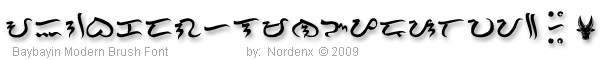
A day ago, I received a package. De Guzman & Co. sent me one of their wonderful timepiece! I am delighted by the gesture and am enthralled by the quality & craftsmanship of their product. It's such a marvelous gift. Proudly Filipino made, obvious with its tagline "Mula sa Republika ng Pilipinas" (From the RP).

For details, visit: deguzmanandco.com

Watch out! 

Watch enthusiasts will appreciate the classic/vintage style of this wristwatch. They sent me an Emerald Green/Black DG009 model with a GMT movement and golden gilt printed dial markers. According to their website, this particular model is also available in Ghost Gray/Red. They also have two other models: DG008 Classic and DG010 Diver. 

It's Time for Baybayin.

Currently, all their timepieces displays a minimalist use of Baybayin characters/letters to represent the hours. These are:

  • — the first syllable for "isa" (1)
  • — the first syllable for "dalawa" (2)
  • — the first syllable for "apat" (4)
  • ᜎᜒ — the first syllable for "lima" (5)
  • ᜉᜒ — the first syllable for "pito" (7)
  • — the first syllable for "walo" (8)
  • — the first syllable for "sampu" (10)
  • — the first syllable for "labing-isa" (11) 

 A Clock with a Chock-full of fine details.

This is a marvelous gift. De Guzman & Co. is a Filipino watch micro-brand, it's very rare to find a watch company like this with products of caliber in the Philippines. Certainly a unique luxury item, offering nothing but the best: sapphire crystal, solid milled clasp, case, and bracelet from 316L stainless steel, screw adjustable links, water resistance up to 100 meters, etc. I am particularly glad that they chose to use my baybayin typeface on their clockface. ^_^

Presentation that's great for gifting.

Many thanks to De Guzman & Co. for this holliday gift, I shall treasure it always. 

This is not just a gift to me, but it is also a gift for all Filipiniana collectors, Filipino watch enthusiasts, and the Baybayin/Philippine script revival & preservation supporters, among others. 

Yes, this must sound like an adertisment. But IMHO this trully makes for a great present. I mean, just look at their packaging! Look at the details and the extras that comes with it. :D

For details, visit: deguzmanandco.com

Facebook: https://www.facebook.com/deguzmanandco 

...


Friday, August 14, 2020

Trace and Teach - educational font

I will be releasing an educational tracing font with starting positions and stroke arrows for kindergarten, beginners, teachers, workbooks, etc. SOON! (I know, often my "soon" turns out to be months or years or never. :P Please be patient.)

However, these fonts will not be free. I plan to release them as commercial fonts. I have been developing these of-and-on since 2003 and they have been a lot of work. Since creating these have been time and labor intensive, I want some return on investment. These fonts will be for sale.

Baybayin Modern Teacher fonts are TrueType fonts that assists young learners in printing Baybayin and Surat Mangyan letter shapes correctly and efficiently.  It provides lines containing dotted letters for students to trace with the starting position and stroke directions illustrated for each letter, and punctuation mark.  The fonts have been carefully developed to provide an intuitive, practical introduction to writing Baybayin and Surat Mangyan.

The fonts uses extended stroke direction arrows to discourage students from lifting their pencils between strokes unnecessarily so that students do not form disjointed letters. Learning correct stroke sequences improves penmanship and encourages students to get used to the cursive and wavy strokes of Baybayin.

Many students never learn correct penmanship because stroke sequences are seldom emphasized in the classroom during formative years. Then in later grades it is very difficult for teachers to correct poor writing habits that are already well encoded into students' procedural memory. Get it right the first time around with Baybayin Modern Teacher fonts!

Besides learning correct stroke sequences, teachers will find that the standardized, uniform, and simpler letter shapes of these fonts to be practical and easier for the students to learn. The typeface is a cleaner and simpler version of the Doctrina Christiana typeface. As always, I added of the set of alternative glyphs from my modern set and proposed reform. I added the modern RA and the kawi based JA, Mangyan pamudpod, x-kudlit, anusvāra, visarga, e/o kudlits, pallawa & padalaw-a marks, and other syllable-doubling marks; assigning them to the appropriate keys.

Baybayin Modern Teacher fonts works like other custom fonts. After you buy the font, you download the font file, and install it on your Mac or PC. Then you use whatever software (like Microsoft Word, Microsoft PowerPoint or other software like Interactive White Board (IWB) software) to create resources for your class, like tracing sheets or flash cards.

Examples:

https://drive.google.com/file/d/1fF1idxzcdkZIdMrmEhvKMYVvnIM9y0r6/view?usp=sharing


Friday, April 05, 2019

Ey! LoCaNo Font!

A LoCaNo Font! Finally!

A new release. But it's not a new font. I've had this in my "Work In Progress" (WIP) folder for years. My procrastinating lazy ass finally got it all cleaned up.


This font is based on the original 15 character set from Fr. Francisco López's 1621 Ilocano translation of the 1597 book Belarmino. The typeface is from Fr. Andrés Carro's Vocabulario de la lengua Ilocana, 1849. I started working on this font back in 2006, I tried to standardize and make the character elements uniform. Of course I added other features that is standard throughout my modern baybayin fonts.

The font name "LoCaNo" is derived from López Carro Nordenx.
 
Download this font set from: https://drive.google.com/file/d/1DaZ90YRmr71bNMrQZy6Hm7SxAP0mOo-j/view?usp=sharing


If you prefer to use López's limited 15 set and Carro's classic typeface as originally printed, you can feel free to do so. However, the characters are typed the way other Nordenx fonts are assigned on the keyboard.
  • Carro's ᜁ "E/I" is assigned in the "I" key. The "E" key renders a Nordenx special "E" character.
  • Carro's ᜂ "O/U" is assigned in the "O" key. The "U" key renders a Nordenx special "U" character.
  • The "B" key renders Carro's ᜊ "BA" while the "V" and "W" keys renders Nordenx's special "VA" and classic "WA" characters respectively.
  • The "K" key renders a classic "KA". The "C" key renders a "TSA" (cha) shortcut.
  • Carro's disjointed ᜇ "DA" can be found under the "9" key. The uppercase "D" key renders a Nordenx special "JA" character and the classic "DA" is the lowercase "d".
  • The "J" and "j" keys types the "DIYA" and "DYA" (ja) shortcut.
  • Uppercase "G" renders Carro's disjointed ᜄ "GA". The lowercase "g" types the classic "GA".
  • The classic ᜎ "LA" is assigned on the "L" key and the Unicode "RA". :P
  • Carro's ᜋ "MA" is typed using the lowercase "y" key. The lowercase "m" key types a classic "MA" character.
  • Uppercase "N" types ᜅ "NGA", the lowercase "n" renders a ᜈ "NA" as usual.
  • Carro's odd ᜉ "FA/PA" is assigned to the uppercase "F" key, the lowercase "f" key displays a Nordenx special "FA" character.
  • Carro's closed-tailed or looped ᜌ "YA" can be typed using the "P" or "p" keys.
  • Carro's V3 shaped ᜐ "SA" can be typed using the "Z" keys. 
  • The "X" and "x" keys types the "KSA" (xa) shortcut.
  • Nordenx special characters for "RA" is assigned in the "R" keys.  
  • The "h" key types a Nordenx special ᜑ "HA" character.
  • Use the + key for Lopez's + virama, the # key for Carro's ☩ virama, and the = key for Nordenx's x virama. 
I feel like I need to go into further detail and explain more about the decisions I made about this set... maybe later. :P

[EULA]
© All rights reserved, Nordenx Baybayin Modern Fonts are copyright of their typeface designer & creator Norman de los Santos. Free for personal and non-commercial use only. Please contact me at nordenx@gmail.com for any inquiries about commercial use and licensing for branding, printing, publications, and/or other electronic applications.

If you have any questions about this odd font set, feel free to email me or message me via facebook. ^_^


------------

Thursday, March 10, 2016

For most of Formosa

13-ICAL Epilogue

The 13th. ICAL (International Conference on Austronesian Linguistics), was held at the Institute of Linguistics in Academia Sinica, Taipei, Taiwan, last July, 18 to 23, 2015.


With the help and support of our fundraising donors, generous people, friends, and family, Mike Pangilinan and I were able to present our papers at ICAL last year. Mike and I greatly appreciate their help.

We and our papers were well received and praised by international linguistic scholars and professionals who were in attendance. Our presentations were on point and they went smoothly. I'm pretty happy with the reception and validation of my work by our peers.

Mike Pangilinan, as our panel leader, introduces me to the audience before my presentation.

I gained a lot of knowledge and experience from this conference. Attending and absorbing most of the presentations that I can catch every day of the event, I've learned much about various studies, methodologies, histories, practices, and projects relating to various Austronesian and Southeast Asian languages. All these knowledge can be applied to further continue our own efforts with Philippine scripts.

I also have met and spent time with the top international Austronesian & SEA language scholars and professionals during the event. Conversations with these great minds were extremely entertaining and enlightening. I got reacquainted with awesome people I've met previously in Tokyo. And I met new and amazing people and made friends with them in this venue.

Gained new important connections and expanded our network, finally met folks from SIL too. There were a couple of acquaintances from social networks whose work on Philippine languages I admire and follow for years; I met them in person for the first time at the conference. It was a bit surreal when we talked as if we've known each other for a long time.

Our papers and presentation slides can be perused at: ical13.ling.sinica.edu.tw/Full_papers_and_ppts

An excellent article in Enquirer.net by Eunice Barbara Novio gives further details about the overall purpose of our participation: inquirer.net/...2-filipinos-work-to-preserve-indigenous-writing-systems

Mangyan, Kulitan, and Baybayin fonts created for our 13-ICAL fundraising (will be released sometime soon):

Mangyan, Kulitan, and Baybayin fonts created for our 13-ICAL fundraising.

...

Postscript:

It took me a while to recover from this trip (my health went on a decline the weeks and months following my return from Taiwan) and I was meaning to write about it earlier last year. Now, the time has come for another linguistic conference and I need to continue moving on to the next level.

Next stop, Manila!

...


Saturday, January 02, 2016

The old and the new.

This has been available for download for a while now but not a lot of people have noticed it:
Download this font set from: https://drive.google.com/file/d/0ByEkLQ7YrpPscFdoRjVtR21Icnc/
It's my cleaner and more standardized version of the Doctrina Christiana typeface. I released it earlier without any fanfare. But I guess I should stop procrastinating this new year as a resolution (fingers crossed), after all, I still haven't released a report from last year's ICAL conference and another one is soon to be due this year.

Anyway... The Modern Doctrina font set has a few features different from Paul Morrow's Tagalog Doctrina 1593 font:


The main and immediately noticeable difference is the addition of the set of alternative glyphs from my modern set and proposed reform. I added the modern RA and the kawi based JA, Mangyan pamudpod, x-kudlit, anusvāra, visarga, e/o kudlits, pallawa & padalaw-a marks, and other syllable-doubling marks; assigning them to the appropriate keys.

What's not immediately noticeable until you use the font is the different aesthetic feel of the typeface. My many tweaks that resulted on character element's uniformity (while keeping with the basic shapes of the old typeface) gives this font a definite modern feel, a lively touch, and youthful appeal.

Paul Morrow's Tagalog Doctrina font used the typeface from the typesetter's proof at the beginning pages of the Doctrina Christiana. (fig. 1 image above)

For the Modern Doctrina font, I sampled and compared each and every character from the whole Doctrina Christiana and determined the recurring elements, forms, and details of each letter.


I evaluated character rotations, print defects, shape & size anomalies, and numerous features. In the end, I developed a clean and unified standard for this new font version but retained the spirit of the old typeface.

Some of the features of the Modern Doctrina font:
  • standardized rounded entry, ends, & edges (sans serif)
  • standardized height & width
  • even cap height (no ascenders)
  • even base line (no descenders)
  • even strokes & line weights
  • standardized forms & elements
  • alternative characters and modern glyphs
  • Tagalog Unicode range included

...

Try it and enjoy! :)

...

[EULA] © All rights reserved, Nordenx Baybayin Modern Fonts are copyright of their typeface designer & creator Norman de los Santos. Free for personal and non-commercial use only. Please contact me at nordenx@gmail.com or nordenx@yahoo.com for any inquiries about commercial use and licensing for branding, printing, publications, and/or other electronic applications.

...

Sunday, December 20, 2015

The Font Awakens

Old Work In Progress Teaser Image

Now Available! I shown the work in progress (WIP) of this Star Wars inspired font earlier this year, the typeface is styled after the lore's Aurebesh script.

It took watching the new Star Wars: Episode VII "The Force Awakens" movie this weekend to find the boost of morale to actually finish this font set.


There are a couple of tweaks and character revisions since the WIP preview I showed earlier. The images below contains the final letter designs.

You can download the fonts now from the download page or directly from the link below:

Download from: https://drive.google.com/file/d/0ByEkLQ7YrpPsbkVpZ01UU1hya2c/view
ASCII font (Keyboard only, CSS embed for web, not extended Unicode)

[EULA]
© All rights reserved, Nordenx Baybayin Modern Fonts are copyright of their typeface designer & creator Norman de los Santos. Free for personal and non-commercial use only. Please contact me at nordenx@gmail.com for any inquiries about commercial use and licensing for branding, printing, publications, and/or other electronic applications.


"May the force be with you."

Star Wars is a TM & © of Lucasfilm Ltd.

...

Wednesday, July 29, 2015

Baybayin on Windows 10

Microsoft's new OS (update) "Windows 10" rolled out today, replacing and improving upon Windows 8+

My desktop's transition to Windows 10 from Win8+ went smoothly. I was expecting a couple of old driver issues (my youngest son had to update his video drivers) but my old machine breezed through the auto installation process. The new OS and its new Internet browser Microsoft Edge has a lot of neat little features.

Edge is simplified, clean, and performs well in most cases, but it’s lacking features you might expect of a modern browser. I noticed that downloads start automatically without giving me a choice of where the files are being stored. A lot of basic stuff feels surprisingly missing. To be fair, Microsoft noted that they started from scratch with Edge. ...it shows.

A neat new feature: you can post little text notes and draw all over webpages and send a copy to friends. It’s useful if you want to quickly share a screenshot of a site with some annotation, but sadly it gets old quick.

But as with most browsers, the one key thing I care about is performance, and Edge mostly delivers. Edge renders most popular websites smoothly, and load times are usually good. However, as I feared, it is not fully Unicode compatible. I can not find any way to change its default font settings and it does not display the Tagalog, Hanunuo, Buhid, and Tagbanwa Unicode range of characters on webpages and the new sticky-note feature has problems displaying stacked/ligatured markers (kudlit, virama, pamudpod). Character & marker combinations like the double-kudlit, possible in Firefox, is not rendered properly in Edge's notes (see image below).

Baybayin deficiencies in Microsoft's new "Edge" Internet browser.

(  ᜀᜁᜂ᜵ᜊᜃᜇᜄᜑᜎᜋᜈᜅᜉᜍᜐᜆᜏᜌ᜶ᜊᜒᜓ ᜊᜒ ᜊᜓ ᜊᜒ ᜒᜊᜓ ᜓᜊ᜔ ᜊ᜴  ᜶᜔ ᜶ᜓ )
The Unicode text (in parentheses) above should match the one in the image.

Another one of my other primary concerns is the default font keyboarding and the custom Baybayin Keyboard Layout. The only trouble I encountered was that I have to re-install the custom Segoe UI font (segoeui.ttf) and reboot my desktop afterwards. Everything else seems to be operating fine right now.

Baybayin fonts and custom keyboard layout works okay in Windows 10.

...