Thursday, January 28, 2010

Baybayin Fonts Typepad

UPDATE:  

Outdated tech, Adobe Flash no longer functions. 


Do you want to test drive fonts before downloading them?
Do you want to write a word in Baybayin and share the IMAGE in Facebook?

If the application below doesn't load, try this link: Baybayin Typepad Page


Font Legend:


Warning! Do not rely on this tool for correct spelling and transliteration. This is a freeform learning tool. Unless you're already proficient with Filipino languages and Baybayin script, transcribing is best left to professionals.

------------

UPDATED to version 2.0
  • updated old fonts and added new fonts
  • added an image capture feature so you can download/save a .jpg copy of what you wrote and then upload/share it to your social media page like Facebook
------------

Sunday, January 24, 2010

Baybayin Transliterator

UPDATE: 

 Outdated, broken links, no longer functions. 


Important Note: This is not a word TRANSLATOR. It does not translate words from English to Filipino. It is a TRANSLITERATION learning tool. You will know if you correctly transcribed a word only when the syllables on display matches the Filipino pronunciation of  the word you want. 

This is also available an application in FaceBook as: Baybayin Keys


Monday, January 18, 2010

A dozen and counting...

For the first ten fonts: >> click here to view the list of fonts from 2010 and earlier <<

+ Two more new free fonts for you!


Download this font set from: http://nordenx.deviantart.com/art/Baybayin-Modern-Sinta-Font-150968942


Download this font set from: http://nordenx.deviantart.com/art/Baybayin-Modern-Mono-Font-150969288

--------------

Baybayin Modern Font (BMF) Sinta has exaggerated ascending & descending strokes and curls. This is influenced by some handwriting/calligraphy exercise I was doing recently.

BMF Mono is monospaced; almost all the glyphs are fixed-width except for the O/U character which is half-width, same as space and comma.

I initially thought that I released the BMF Mono when I released BMF Print. I apologize for procrastinating, I should've released this one a long time ago. Mono differs from Print in a couple of ways where Print is much more simplified, bolder, and has variable-width.

--------------

"Alam mo, nung bata pa ako, ang tawag ko sa sulat natin ay Alibata? Alibata, alibata, alibata... parang pang bata. Ngayong matanda na ako, alam kong basahin, alam kong baybayin, alam ko ang sulat pilipino. Baybayin ang tawag dito. Baybayin natin ito."

--------------

Thursday, January 14, 2010

Tuesday, January 12, 2010

Galit sa kulit.

Learning the Kapampangan style of baybayin.

Súlat Kapampángan (a.k.a. pámagkulit, kulitan) has been kept alive by loyal practitioners, but for a long time it was only limited to the elite few - the scholars, intellectuals, and advocates. It is currently on a sort of revival with local youths, thanks to recent publications, several active organizations in universities in the Philippines, local artists, and the Internet. However, the Doctrina Christiana based Tagalog (sans-virama) and Ilocano (w/ virama) versions of baybayin are more prevalent with Filipinos outside of the Philippines. This is due to the proliferation of sites that are a dedicated to "traditional" baybayin in that style, not to mention a larger population of Tagalog/Ilocano speakers and their third-generation (Fil-Am, Fil-Canadian, etc.) children who are rabidly searching for their roots and holding on to heritage.

Garlit at Kudlit

"Garlit" is the Kapampangan term for "Kudlit" (dot or stroke diacritic marks) and Súlat Kapampángan use the top & bottom kudlit to change each consonant character's default "a" sound to the basic "i" and "u" respectively, just like other versions of baybayin. But unlike the "traditional" baybayin, Súlat Kapampángan has a way to change the "i" and "u" sounds to "e" and "o" as well as lengthen the "a", "i", and "u" sounds:
  • To render an "e", write the character (not the kudlit) for "I" next to the consonant.
  • To render an "o", write the character (not the kudlit) for "U" next to the consonant.
  • To lengthen the "a" sound, write the character for "A" next to the consonant.
  • To lengthen the "e" sound, write the character (not the kudlit) for "I" next to the consonant that already has an "i" kudlit.
  • To lengthen the "u" sound, write the character (not the kudlit) for "U" next to the consonant that already has an "u" kudlit.
These methods work particularly well with the Kapampangan language since their "o" and "e" vowels are conversions of diphthongs to monophthongs, but it may be cumbersome if not confusing to other Filipinos who are mainly used to Tagalog, particularly the Filipinos born outside of the Philippines whose proficiency with other Filipino language is mediocre at best, let alone having an ear for the accents of native languages.

The Kapampangan language does not use the "H" sound except in loan words, naturally Súlat Kapampángan does not have a glyph for "Ha". It also doesn't have characters for the "W" and "Y" sounds, instead the glyph for "U" represents the "W" sound and the glyph for "I" is used for the "Y" sound. Furthermore, "Wa" is rendered by combining the "U" & "A" characters, while "Ya" is rendered by the combination of "I" and "A" characters. Also, to render a standalone "E", ligatured glyphs "A" & "I" are used; and to get a standalone "O", use the combination of "A" & "U" glyphs.

Virama, who needs yah?!

Forming consonant conjuncts by creating compound character ligatures is a method where trailing consonants (consonants without vowel sounds at the end of a syllable) can be written without using a virama (vowel cancellation mark) in order to render dead consonants in Súlat Kapampángan. Just like the virama, this method is adopted from other Brahmic scripts, and this method is also observed and recorded on the oldest artifact that bears Kawi (Old Javanese) and a proto-baybayin form of writing; the Laguna Copperplate Inscription (LCI).

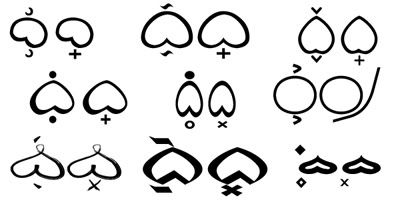
When writing horizontally (an alternative way), to remove the default vowel from a consonantal character, its glyph is stacked under its preceding "main" syllable character.

When writing vertically (preferred and considered traditional), to remove the default vowel from a consonantal character, its glyph is placed at the right of its preceding "main" syllable character.

Different ways to kill a vowel (and leave a dead consonant):


The Kapampangan method can be quite beautiful when used for typographic arts such as logos, tribal tattoos, calligraphy, etc. And if you're opposed to using the Spanish addition of a cross kudlit or any form of virama mark but still want to render trailing consonants (leading consonants is another story), then feel free to use the Kapampangan version of baybayin.

Caveat lector

While the Kapampangan method has its advantages with a wider range of vowels and its ability to render trailing consonants, it is perfect for writing the Kapampangan language. However, it has its limitations when it comes to standardization or modern typeface design and word processing as well as rendering non-Kapampangan or foreign loan words. Legibility is often compromised when writing vertically, since stacking a character with a kudlit over another tends to confuse readers as to which glyph the kudlit belongs to, especially when spacing between characters are too close.

Súlat Kapampángan characters' evolution appeared to have diverted from other baybayin scripts through time since the 17th century. A 1699 publication, "El Arte de lengua Pampanga" by Alvaro de Benavente shows Kapampangan characters that are still very similar to the Ilocano script characters recorded in the 1620 Doctrina Cristiana with only slight variations on a couple of characters. Benavente's script also bears much resemble to the current living Tagbanua script from Palawan. Comparison of Benavente's script to the scripts recorded in recent publications from the 1960's up to 2008 by the likes of Zoilo Hilario, Mariano Henson, and Michael Pangilinan, et al. shows how cataloging handwriting changed the glyphs dramatically. And it is not just stylistic changes but the basic form of several Kapampangan characters have totally deviated from the Tagalog/Ilocano versions of baybayin. Couple these changes with the unique (vertical - top to bottom direction) method of writing, Súlat Kapampángan is in a class of its own. Another Philippine script that evolved similarly is Bikol's Basahan script (that's another story).

See sample images here: www.siuala.com

Emulating the Kapampangan writing method using "traditional" Tagalog/Ilocano baybayin characters could be a sensitive issue. On one hand we do not want to offend regional sensibilities, on the other hand imitation is the purest form of flattery. We should be proud and thankful that Kapampangans kept their script alive as did the Mangyans of Mindoro and the Tagbanua of Palawan. Indeed we need to look back to our pre-Hispanic austronesian and Brahmic origins as well as the preserved manuscripts from colonial times in order to understand our lingustic roots, but we also need to look at the current living scripts in order to find ways to save traditional baybayin. It may be idealistic to want to have a standardized script to represent all Filipinos, but we need to consider all things at hand and take careful steps to keep baybayin going for future generations.

One thing for sure, if you use the Kapampangan method with traditional baybayin script, it opens a new doorway to freely express yourself artistically and typographically. :)

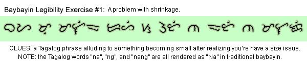
Kapampangan style baybayin calligraphy - Tagalog words rendered using traditional Baybayin characters in Kapampangan arrangement creates interesting artwork:


(left) "bulaklak" vertically; (right) "bubuyog" horizontally
Enhanced by Zemanta

Monday, January 11, 2010

On your mark, get set, xo! The great baybayin kudlit race begins.

Slit, slash, dot, dot, dit, dit, XOXO, LOL! It may sound funny to you but it's no laughing matter.

XOXOXO
Different styles of kudlit marks.

Cross "Kudlit" - Ang kulit n'yo!

Ever since the Spanish priest Fr. Francisco Lopez introduced the cross-shaped kudlit back in 1620 for the Ilocano printing of Doctrina Cristiana, we have been at odds with "reform". Whether it's truly a matter of principle, or protest, or stubbornness, the two camps of baybáyin practitioners (traditionalists and reformists) need to find a middle ground. While the first two reasons (principle & protest) are reasonable personal choice/preference, the stubborn ones are quite beyond reason.

While some baybayin practitioners might say that the Spaniards (Lopez) "invented" the cross kudlit just to convert more natives into Christianity, that is hearsay (or should I say "heresy"? (sic, pun)). It is true though that the Doctrina Cristiana books were published to take advantage of the native people's literacy. However, the motivation for the friars to "reform" baybáyin script for legibility has its merit in modern typography. The decision to include a baybayin version of the virama (vowel cancellation mark) is not just a spur of the moment "invention" but it is more likely based on a careful study of linguistics by scholars (who happen to also be friars) at the time. Other writing methods (Abugida) related to or predecessors of baybayin have vowel cancellation marks or systems, so adopting a similar system is not entirely unreasonable. Note also that the kavi script in the Laguna Copperplate Inscriptions (LCI), which is dated back to 900CE, used both virama and ligatured glyphs to cancel vowel sounds similar to the methods of other Brahmic scripts and also what is currently being developed for the Súlat Kapampángan version of baybáyin.


A cleaned-up illustration of the Laguna Copperplate inscription

The virama for Tagalog Baybáyin was rejected by natives because they considered the script adequate without it. While that works well for their need at the time, the Filipino languages' lexicon has grown dramatically since then. The need for a virama becomes apparent even when writing the most mundane notes:

Correction on top image: Typo "you're" was supposed to be "you".

When asked to read the sentence above, written in traditional "no dead consonants" method, the most common response was: "bayag mo'y maliit dahil sa utin ng itim na malaki", which means: "your balls are small (shrunk) because of (seeing) the black guy's big organ". Imagine the confusion at a duck farm in Pateros. Incited after a client ordered several breeding pairs of ducks and he received this note along with his bill? When all the poor farmer wanted to convey is, "bayad mo'y maliit dahil sa unti ng itik na malaki", meaning, "your bill is small because we are short on adult itik ducks". The farmer, just wanting to make up for the incomplete order by giving his client a discount, unwittingly conveyed the wrong message.

Whatever your qualms are about the cross kudlit, for baybáyin to be useful in writing normal correspondence these days, the virama is a practical approach. Even the Mangyan "pamudpod" mark, introduced by Dutch anthropologist Antoon Postma, has been better received and is used by the Hanunóo. While the Kapampangan method of vowel cancellation is proving quite useful for both modern & traditional artistic design; although it has its limitations when it comes to modern typography (typing in a word processor and publication) and creating standardized fonts. For arts and crafts, tradition is fine. But for common use like signage and publishing, the virama is important. I say, learn to use both methods and teach both methods. Use whichever method is appropriate for the composition at hand.

Kulitan blues continues!

Crescents, and dashes, and dots, oh my! So many stylistic takes on the kudlit markers! I don't really mind at all, even I do them differently from time to time depending on the style of the characters I am creating or writing. The problem arises when artists and font designers develop or stylize separate marks for soft and hard vowels e/o and i/u respectively, where crescents are flipped, dashes angled differently, and dots become hollow and solid. I don't discourage the practice (I also do it), but I want people to think about ease of legibility especially when designing fonts.

Don't get me started on coming up with new punctuation marks and numbers! ...that's another blog topic. ;)

Sunday, January 03, 2010

Sulat Mangyan

This is my version of the Hanunóo tribe's Surat Mangyan (also known to us locals as Sulat Mangyan). I received several request for this Mangyan script from my fellow Mindoreños. I also got tired of looking for the script hidden inside other font sets like the Quivira.ttf where you have to know how to access the Unicode range in order to view or use the Hanunóo or Buhid characters in that set.

What's new?

Like my previous font, Mindoro, I included the pamudpod as well as the cross kudlit or virama. To access the pamudpod use the equal key ( = ) and to access the virama use the plus key ( + ).

There is a new kudlit system?

The Nordenx fonts are created so that a standard western keyboard can easily access the baybayin characters. However, please note that the Mangyan script have different kudlit positions depending on what character is used. These different kudlit positions can be accessed by typing the keys for e, i, o, u, 1, 2, 3, 4, 5, and 6 (see sample image in the download page). Using these keys, you can easily and accurately position your kudlits to write the proper Mangyan syllables

NEW RELEASE:

Download this font set from: http://nordenx.deviantart.com/art/Mangyan-Hanunoo-Font-149145096

Hanunóo writing is used mainly to write love songs or ʼambāhan, and also for regular and romantic correspondence. Learn more about this native art so that you may emulate them in your compositions. Please visit: http://www.mangyan.org/
Enhanced by Zemanta

Saturday, January 02, 2010

Mindoro Tagalog Font

Named after the island of the Mangyans, from where I was born and where I grew up. This is a heavily stylized version of baybayin. The style is based on the Buhid's Sulat Mangyan but the characters are still based on the Tagalog/Ilocano form.

What's new?

I included an alternate Mangyan version of the virama (vowel cancelling kudlit) mark called a "pamudpod". It works the same way as the Spanish cross kudlit which is also still available. The pamudpod works aesthetically well at the end of a word while the cross particularly works well in the middle (and at the end) of a word. You can use either one or both or neither in your composition; your choice.

NEW RELEASE:

Download this font set from: http://nordenx.deviantart.com/art/Baybayin-Modern-Mindoro-Font-149015455

Friday, January 01, 2010

First new font release for 2010

I actually worked on this last 2007 but forgotten about it until this month when I started working on baybayin fonts again. After a few tweaks, here it is:

NEW RELEASE:

Download this font set from: http://nordenx.deviantart.com/art/Batbayin-Modern-Brush-Font-148846227