Saturday, September 10, 2011

Unicode Converter Update

UPDATE:  

Outdated tech, Adobe Flash no longer functions.  

 
Now it is even easier to type in Baybayin Unicode and copy/paste it to Facebook!
Non-baybayin-reading folks can now translate what others wrote in Baybayin Unicode!

Use the Baybayin Unicode Converter today! :)

ᜇᜓᜋᜍᜋᜒ ᜈ ᜀᜅ᜴ ᜄᜓᜋᜄᜋᜒᜆ᜴ ᜅ᜔ ᜊᜌ᜴ᜊᜌᜒᜈ᜴ ᜐ ᜉᜒᜌ᜔ᜐ᜴ᜊᜓᜃ᜴᜶ ᜇᜑᜒᜎ᜴ ᜇᜒᜆᜓ᜵ ᜇᜓᜋᜍᜋᜒ ᜈ ᜍᜒᜈ᜴ ᜀᜅ᜴ ᜎᜓᜋᜎᜉᜒᜆ᜴ ᜐ ᜀᜃᜒᜈ᜴ ᜈ ᜀᜅ᜴ ᜑᜒᜎᜒᜅ᜴ ᜀᜌ᜴ ᜀᜌᜓᜐᜒᜈ᜴ ᜃᜓ ᜇᜏ᜴ ᜁᜆᜓᜅ᜴ ᜀᜉ᜴ᜎᜒᜃᜐ᜴ᜌᜓᜈ᜴ ᜈ ᜁᜆᜓ ᜉᜍ ᜁᜆᜓᜌ᜔ ᜋᜀᜀᜍᜒᜅ᜴ ᜋᜃᜊᜐ ᜇᜒᜈ᜴ ᜅ᜔ ᜂᜈᜒᜃᜓᜇ᜴᜶

The Baybayin Unicode Converter (Typepad) has been updated:

  • If you see boxes above instead of Baybayin characters - Download the updated Baybayin Modern Font (BMF) Unicode Mono - Updated: Sept. 10, 2011
    If you have downloaded this font before this update, please re-download & update your .ttf file.
  • The font's glyphs have been updated for better legibility, strokes adjusted and the x virama made larger.
  • It can now convert Baybayin Unicode into text. To convert Baybayin Unicode to text, select the "READ Baybayin Unicode" tool option on the drop-down menu, copy then paste the characters you wish to convert onto the text area, then click the "conv" (convert) button.
  • There are two new typing modes; the x Mode automatically types a virama below each character making them stand alone consonants, while the a Mode types syllable characters with the default 'a' vowel sound. Depending on which mode you use, typing vowels or kudlit marks after each character alters the default 'a' or cancels an auto-typed virama.
  • There is a ·· check-box that allows double kudlit marks which repeats a same-vowel syllable. It is automatically unchecked after each double kudlit is typed.
  •  A new "copy" (to clipboard) button is added to the "TYPE Baybayin Unicode" tool option to make it quick & easy to do so, it automatically highlights and copies everything you typed.
  • The Surat Mangyan pamudpod mark Unicode range is made accessible so you can use it if you chose to follow the following proposed modern virama rules:
  1. x = virama [Spanish cross kudlit (+)]: rendered by the = equal and + plus keys, it cancels vowels, preferably for leading or stand-alone consonant sounds;
    ex. ᜊ᜔ᜍᜓ bro | ᜅ᜔ ng
  2. / = pamudpod (Mangyan's virama): rendered by the / forward-slash key, it cancels vowels, preferably for trailing or dead-consonat sounds;
    ex. ᜊᜍ᜴ bar | ᜈᜅ᜴ nang
Enjoy! :)
Enhanced by Zemanta

Sunday, August 28, 2011

Kulitan Angulo Typepad

One of the main difference of Súlat Kapampángan from Baybayin is its vertical direction which the current Kulitan Script practitioners consider as the standard. The other unique feature is stacking characters and syllable grouping (instead of sequential characters in a word grouping). While beautiful in handwritten executions, it poses a few problems for modern typographers and font designers; just like the hurdles other developers face when designing Asiatic fonts. It requires a bit of advanced technical know-how and some special programs/apps to pull off. A level of difficulty that I have yet to master. And so, I experiment...

UPDATE:  

Outdated tech, Adobe Flash no longer functions. 


I am currently developing/designing the Kulitan Angulo Font used for the typepad above. The font is a horizontaly typed font with glyphs/characters tilted on its side, 90° counterclockwise. The typepad above is specially programed to automatically tilt or "change the angle" (hence the font name "Angulo") of the typing area so you can view (and be able to continue to type) in the traditional vertical manner intended for the script.
 

For Word-processing:


One can use the font in a word-processing program like Microsoft Word without any special setup; just type horizontally then after you print the document, all you have to do is turn the printed material 90° clockwise and the composition is vertically oriented as is normal with Kulitan.

However, you can also use the font to type vertically in Microsoft Word by using a table with a simple & easy setup:

  • Insert a single-cell borderless table and re-size it as close to the margins of the page as possible.
  • (in Word 2003 or earlier) Select the table, click Format on the top menu. Click "Text Direction" and choose the direction you want (Vertical).
  • (in Word 2007 or later), click the Table Tools, Layout tab, and click the Text Direction button in the Alignment group.

Keystrokes:

Check the Keystroke & Character Chart (.pdf) for more info on how to type stacked characters.


Caveats:  
  1. Problems arise when the syllable stacks/ligatures require more than two major characters. The only work-around right now is to use another line above the stack to add a third major character.
  2. Constant shift-key usage because of alternating upper & lowercase keyboard characters to stack glyphs takes a lot of getting used to.  
  3. The Nga character needed to be re-assigned to the unused H and h keys because the Na character needs both N and n keys for the upper & lower stacks. I was told that there's a joke about Kapampangan typewriters and the H keys, but I assure you that I was completely oblivious about that when I assigned the glyph to the key.
  4. Double spacing is required to optimally separate columns and rows of syllable groups as required by  Súlat Kapampángan.

    The lyrics to the Kapampangan folk-song "Atin Cu Pung Singsing" below shows how it is typed using the Kulitan Angulo Font:
     
     
    CORRECTIONS: 
    1) I forgot to write the 4th line "king indung ibatan" in the "Atin ku pung singsing" lyrics.
    2) The 2nd to last line "mewala ya iti" has a typo; 3rd syllable should be typed as 'luA" instead of "tuA".

    You have to judge whether or not typing horizontally in this manner is better than setting up tables to be able to type vertically using the previous (and first Kapampangan Script) font I released earlier this month: Baybayin Kapampangan

    Please review my previous blog entry about Súlat Kapampángan: Galit sa kulit - it explains some of the details about the Kapampangan method of writing.

    Don't forget to visit Michael Pangilinan's siuala.com


    UPDATE: Kulitan Typepad version 2.5
    • Kulitan Angulo Font updated to incorporate an experimental "quarter stacking" or "square stack" syllables to render leading & trailing compound consonants of non-Kapampangan words.
    • Introducing a modern character RA for borrowed words. Basically an embellished DA, adding the bottom stroke of LA - similar to the modern Baybayin RA (ᜍ). 
    • Check the Keystroke & Character Chart (.pdf) for info on how to type stacked characters.

    UPDATE: Kulitan Typepad version 2.0
    • Added a button to take an image capture of your composition and save it to your computer - so you can upload it and share it on Facebook if you want others to check your work.
    • Added a positional slider when in vertical mode to slide the column to the center when taking a, image capture.
    ...

    Friday, August 12, 2011

    Mangyan Postma Font

    Mr. Antoon Vreeze Postma is a Dutch anthropologist and linguist who has married into and has been living for more than fifty years among the Hanunuo Mangyan tribe in Mindoro, Philippines. He is best known for being the first to decipher the Laguna Copperplate Inscription, and for documenting the Hanunóo script, paving the way for its preservation. He is the founder of the Mangyan Research Center in Panaytayan, Mansalay, Mr. Postma is in charge of the (MHC) Mangyan Heritage Center's research operations. His collection forms the bulk of the materials in the MHC library.

    I visited the MHC in my home town of Calapan City, Oriental Mindoro, last year (August 2010). I purchased several of Postma's books and watched how they still use handwriting to record and catalog Ambahan poetry and other learning materials. I showed Mrs. Emily Lorenzo Catapang (Executive Director of MHC) how to instal and use Mangyan fonts on their computers so that they can have a modern alternative way of publishing materials. I promised to continue developing and perfecting fonts for Surat Mangyan for the very purpose of propagating and preserving the written cultural heritage of the Mangyan.

    This new font was inspired by Postma's works. Baybayin Mangyan Postma Type has bold and uniform strokes best suited for posters and other print. This font is based on one of Postma's book cover art.

    New Mangyan Font:

    Download this font set from: http://nordenx.deviantart.com/art/Mangyan-Hanunoo-Postma-Font-252407086
    --------------

    Mangyan Fonts from 2010:

    Download this new font set from: http://nordenx.deviantart.com/art/Mangyan-Hanunoo-Brush-Font-169880405


    Download this font set from: http://nordenx.deviantart.com/art/Mangyan-Hanunoo-Font-149145096

    --------------
    Enhanced by Zemanta

    Tuesday, August 02, 2011

    Baybayin Kapampangan

    Súlat Kapampángan (a.k.a. pámagkulit or kulitan) is used for writing the Kapampangan language spoken by folks from the Pampanga province in the Philippines. Kapampangan is one of the major languages of the Philippines.


    Kulitan differs slightly from Baybayin as it has been recently adapted solely for Kapampangan orthography. A different method of writing a combination of garlit (kudlit) diacritic marks with character ligatures & stacking is developed. Much of the character shapes originally were the same as Baybayin but through limited but continued use, Kulitan handwriting slowly evolved and in the recent decades they have changed to suit a vertical direction of writing popularized by current Kapampangan practitioners, scholars, artists, and academics.

    Please review my previous blog entry about Súlat Kapampángan: Galit sa kulit - it explains some of the details about the Kapampangan method of writing.

    NOW AVAILABLE! A NEW KAPAMPANGAN FONT! ~


    Download this font set from: http://nordenx.deviantart.com/art/Baybayin-Pamagkulit-Font-246309064

    Watch this video tutorial on "How to type Kapampangan script (Kulitan) vertically in Microsoft Word using the Pamagkulit Font inside a table." Please watch it in Full Screen Mode to see the details:


    NOTE: Tagalog, Mangyan Hanunóo, Magyan Buhid, and Tagbanua have assigned Unicode blocks or ranges; Kapampangan does not have any assigned to it.

    ...

    For more info about Súlat Kapampángan, visit: Siuálâ Ding Meángûbié

    ...
    Enhanced by Zemanta

    Tuesday, July 26, 2011

    Unique Code

    A request was asked of me to separate the Unicode compliant set of my fonts from the keyboard accessible parts; creating two files in one package so that people can pick/choose which Unicode typeface/font style they want to use for browsing. This is a great idea because when you have several of my fonts or Paul Morrow's fonts in your PC, the unicode sets tend to overlap each other in web browsers. And browsers are weird, I don't know how it picks & chooses the 'winner' because I've tried many different setting combinations in different browsers and resulted in different fonts being picked. I've been experimenting with settings within the font files themselves as well with no luck.

    That is why I tend to keep only one font file in my "C:\WINDOWS\Fonts" folder to solve the clashing issue; I keep the other font files in my shared Adobe fonts folder - since I only use Baybayin fonts for Adobe apps like Photoshop, Illustrator, Flash, etc. Whenever I need to use a font for word processing, that's when I install the font in my windows/font folder; removing it after I already printed my document or embedded the font in .pdf file. ...quite a cumbersome system, I know, it can't work for everybody.

    The problem is that it will take a lot of time & work and I am lazy bastard. But I really do love the idea and I promise that I will implement it. ...sometime in the future. :P
    Enhanced by Zemanta

    Sunday, July 17, 2011

    Horrified with Modified

    As I release western style baybayin fonts, I begin to wonder about how the community will receive them.

    Western Style Baybayin Typefaces

    Over the years, I received numerous emails and private messages regarding my fonts and my efforts in standardizing the script for typography, uniformity of stokes, ease of legibility, ease of access, and synchronization with modern Filipino orthography. A lot of these correspondences are positive and very encouraging. However there a a few that are not. It seems that I have not made my intentions clear. People sometimes see the adjective "modern" in the name of my fonts and they immediately think "modified" which  some view with the same disdain they feel when they think that something is a product of "colonial mentality".
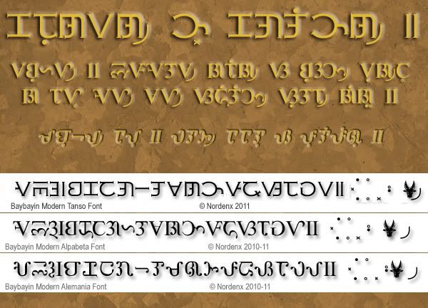
    Modern Modified

    Ra Rah! To tell you the truth, the only glyph I consider "modified" in my fonts is my ᜍ Ra character. But even ᜍ Ra as an alternative character is basically still an embellished "traditional" ᜇ Da. Maybe that's why folks accept it; I'm just pleasantly pleased that it has been well received by many. In that light, my other "alternative" characters are designed in the same fashion; an embellished ᜐ Sa for Za, an embellished ᜁ I for E, and an embellished ᜂ U for O.

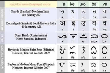
    Ba Va Boom! Some folks are confused by my other characters which are actually NOT embellished versions of the another (Filipino) phoneme equivalent but are actually true (earlier recorded) representation of the same character; O Ba is the same ᜊ Ba but I assigned the round O Ba to the 'V' key because it more resembles the phoneme matching characters in related family of Indic & South East Asian scripts.

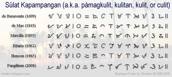
    Oye Pa Fa! The traditional F-shaped ᜉ Pa is still the same as the old Kapampangan closed-loop P-shaped Pa so I assigned the F-shaped one to the 'F' key and the P-shaped one to the 'P' key [shape-wise it makes sense to me] - however, the old closed-loop Ya is very much similar to the old closed-loop Pa, so I chose to include & assign a current but still traditional loop-less ᜌ Ya to the 'Y'  key.

    e, ang kulit o! People fail to see that even if I propose and include these alternatives, they are available to them only if they wish to use them. If you like the style of a font and want to write in the old traditional way - you can do so. It's there for you, it's free, it's easy! Just because I included the hollow ○ kudlit mark for mid vowels e and o doesn't mean you have to use them or even disregard the whole font just because you think that the solid ● kudlit mark is the proper mark (I'll get to you 'mix & dash' supporters later). Same goes to the virama and pamudpod (vowel cancellation marks), I included them because they are culturally & historically relevant. Just because they are introduced by foreigners doesn't mean that they are linguistically wrong. Virama and pamudpod marks are valid methods of vowel cancellation used by baybayin's parent Indic & relative Malay/Austronesian scripts. The virama method is very old but still very effective. Heck, it was introduced to baybayin by the Spanish scholars for the very same reason I saw it fit for use - to adapt with changing times.

    Adobo at pandesal... More than 300 years of Hispanic and western influence has infused and change our culture and language. Good or bad, these influences have become uniquely and traditionally ours. The krus kudlit (cross-shaped virama) was introduced in the 16th century to adapt baybayin script to Spanish orthography, and despite the native population's adamant reluctance to use it for everyday writing, they conceded to use it when writing Spanish words. After several centuries, like adobo & pandesal, our language & culture adapted and changed, but baybayin never did. Could the early practitioner's staunch tradition and resistance to change have contributed to baybayin's disuse? The krus kudlit is as old as the introduction of the word adobo and the bread pandesal to Filipinos and while the food stuff became "traditional" Filipino fare, the cross-shaped mark became a hated symbol of Spanish oppression - a funny thing coming from a country of devout Catholics.


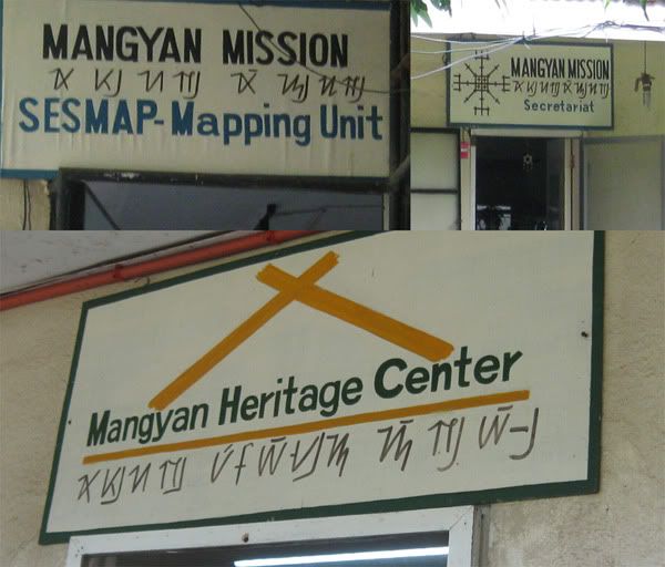
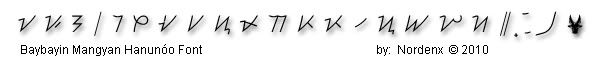
    pud! galoryus pud!
    What's fresh and what's cooking? Being from Mindoro Island, the home of the Mangyan tribes, I have been interested with the pamudpod; their version of a virama. The pamudpod mark and a Ra character were introduced  several decades ago by Dutch anthropologist Antoon Postma, who has married into and lives among the Hanunóo, a Mangyan sub-tribe in Mindoro, Philippines. What interests me is how readily the Mangyan accepted and implimented this marks & method of canceling inherent vowels. As you can see from the photo-collage above from my visit to Mindoro last year (2010), it is now commonly used everyday by the tribes. All Mangyan books, souvenir nicknacks, shirts, handicrafts and artifacts I encountered back home bears the newly introduced mark & character. This is especially true when a Mangyan language composition is mixed with Tagalog, and foreign words. This is another reason why I included a Ra and pamudpod mark in my fonts.

    BOTTOM LINE:

    Just because my fonts have the adjective 'modern' attached to its name and the characters have been stylized, it doesn't mean that they can not be used in the traditional way of baybayin. Each character in all my fonts retain the traditional character form & shapes.

    I also can't stress enough that you learn both the traditional method & Spanish "reformed" method of writing baybayin and educate yourself about Filipino languages and orthography.

    Paul Morrow's site is the best place to start: Sarisari etc.

    And don't forget to check out the other links listed on the sidebar of this blog.
    Enhanced by Zemanta

    Saturday, July 16, 2011

    Ganado


    Download this font from: http://nordenx.deviantart.com/art/Baybayin-Modern-Gana-Font-225516266

    I finally finished uploading all updated Baybayin Modern Fonts this month and released several new fonts along with the it.

    For a list of all the fonts, click here: "FONT DOWNLOAD PAGE"

    Included in all my fonts are alternative glyphs/characters that you can use if you prefer to.
    1. ᜍ = ra: may be the only character modification I introduce. Its shape is carefully designed and based on D, P, R letter shapes and ᜇᜎᜉᜁ character shapes, strokes & qualities as well as the Bikolano, Mangyan, other Malay, and other Asian ra characters.
    2. x = virama [Spanish cross kudlit (+)]: rendered by the = equal and + plus keys, it cancels vowels, preferably for leading or stand-alone consonant sounds;
      ex. ᜊ᜔ᜍᜓ bro | ᜅ᜔ ng
    3. / = pamudpod (Mangyan's virama): rendered by the / forward-slash key, it cancels vowels, preferably for trailing or dead-consonat sounds;
      ex. ᜊᜍ/ bar | ᜈᜅ/ nang
    4. ● = solid kudlit marks can be used as traditional kudlits, I use them for high vowels i and u kudlit.
    5. o = hollow kudlit marks are alternatives that I use for the mid vowels e and o.
    The other alternate characters (not modified, just a different style of the same type/character):
    1. O = ᜊ can still be pronounced as ba but can be used to signify va.
    2. vz = ᜐ can still be pronounced as sa but can be used to signify za.
    3. I and U characters has more complex strokes than E and O but are essentially still the same I/E and O/U characters.
    4. Uppercase Q renders the character combination ᜃ᜔ᜏ k'wa.
    5. Lowercase q renders the character combination ᜃᜓᜏ kuwa.
    6. Uppercase J renders the character combination ᜇ᜔ᜌ d'ya.
    7. Lowercase j renders the character combination ᜇᜒᜌ diya.
    8. Both X and x renders the character combination ᜃ᜔ᜐ k'sa. eg. ᜁᜃ᜔ᜐᜋ/ = exam
    9. Some font sets have ᜆ᜔ᜐ t'sa or cha assigned to uppercase C.
    10. Updated in all fonts, the A character ᜀ can now only be accessed by the uppercase A like the other vowel characters I, E, O, and U.
    11. You can use ᜉ fa as the traditional pa.
    12. My fonts use an old loop-ended version of pa that some of you may mistake as the old loop-ended ya. You may substitute them if you're looking for a traditional look.
    13. My ᜌ ya is a more modern open ended (non-loop-ended) glyph.
    The updates reassigned several glyphs to different keys, standardized & cleaned several character strokes, and fixed compatibility clashing issues.
      Enhanced by Zemanta