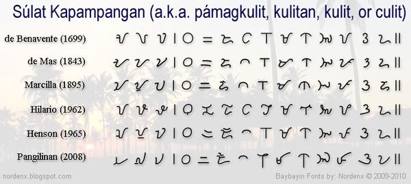
One of the main difference of Súlat Kapampángan from Baybayin is its vertical direction which the current Kulitan Script practitioners consider as the standard. The other unique feature is stacking characters and syllable grouping (instead of sequential characters in a word grouping). While beautiful in handwritten executions, it poses a few problems for modern typographers and font designers; just like the hurdles other developers face when designing Asiatic fonts. It requires a bit of advanced technical know-how and some special programs/apps to pull off. A level of difficulty that I have yet to master. And so, I experiment...
UPDATE:
Outdated tech, Adobe Flash no longer functions.
I am currently developing/designing the Kulitan Angulo Font used for the typepad above. The font is a horizontaly typed font with glyphs/characters tilted on its side, 90° counterclockwise. The typepad above is specially programed to automatically tilt or "change the angle" (hence the font name "Angulo") of the typing area so you can view (and be able to continue to type) in the traditional vertical manner intended for the script.
For Word-processing:

One can use the font in a word-processing program like Microsoft Word without any special setup; just type horizontally then after you print the document, all you have to do is turn the printed material 90° clockwise and the composition is vertically oriented as is normal with Kulitan.
However, you can also use the font to type vertically in Microsoft Word by using a table with a simple & easy setup:
- Insert a single-cell borderless table and re-size it as close to the margins of the page as possible.
- (in Word 2003 or earlier) Select the table, click Format on the top menu. Click "Text Direction" and choose the direction you want (Vertical).
- (in Word 2007 or later), click the Table Tools, Layout tab, and click the Text Direction button in the Alignment group.
Keystrokes:

Caveats:
- Problems arise when the syllable stacks/ligatures require more than two major characters. The only work-around right now is to use another line above the stack to add a third major character.
- Constant shift-key usage because of alternating upper & lowercase keyboard characters to stack glyphs takes a lot of getting used to.
- The Nga character needed to be re-assigned to the unused H and h keys because the Na character needs both N and n keys for the upper & lower stacks. I was told that there's a joke about Kapampangan typewriters and the H keys, but I assure you that I was completely oblivious about that when I assigned the glyph to the key.
- Double spacing is required to optimally separate columns and rows of syllable groups as required by Súlat Kapampángan.

1) I forgot to write the 4th line "king indung ibatan" in the "Atin ku pung singsing" lyrics.
2) The 2nd to last line "mewala ya iti" has a typo; 3rd syllable should be typed as 'luA" instead of "tuA".
You have to judge whether or not typing horizontally in this manner is better than setting up tables to be able to type vertically using the previous (and first Kapampangan Script) font I released earlier this month: Baybayin Kapampangan
Please review my previous blog entry about Súlat Kapampángan: Galit sa kulit - it explains some of the details about the Kapampangan method of writing.
Don't forget to visit Michael Pangilinan's siuala.com
UPDATE: Kulitan Typepad version 2.5
- Kulitan Angulo Font updated to incorporate an experimental "quarter stacking" or "square stack" syllables to render leading & trailing compound consonants of non-Kapampangan words.
- Introducing a modern character RA for borrowed words. Basically an embellished DA, adding the bottom stroke of LA - similar to the modern Baybayin RA (ᜍ).
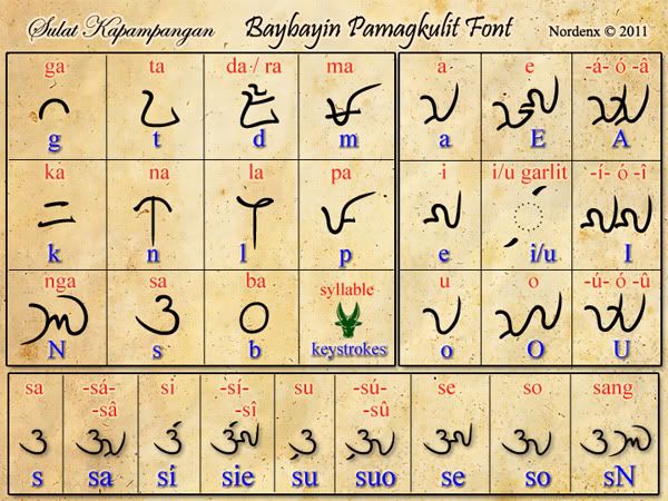
- Check the Keystroke & Character Chart (.pdf) for info on how to type stacked characters.
UPDATE: Kulitan Typepad version 2.0
- Added a button to take an image capture of your composition and save it to your computer - so you can upload it and share it on Facebook if you want others to check your work.
- Added a positional slider when in vertical mode to slide the column to the center when taking a, image capture.