UPDATE (July 24, 2011):
It has been half a decade since I started blogging here and this page has the most page views and according to the site's tracker, this page apparently has become the entry point where most web search lands on. So, before you continue to read the old content below, I'd like to remind you that more recent and updated info are available in the front
HOME/NEWS page and all updated baybayin fonts can be accessed from the:
DOWNLOAD PAGE.
ORIGINAL POST DATE (July 9, 2007):
The Script
The ScriptBaybayin script is an ancient form of writing by native islanders and tribes in the South East Asian archipelago we now know as the Philippines. For a comprehensive detail about Baybayin, you can find almost everything there is to know about it from this site:
Paul Morrow's Site
What's New?
I just released a new font set. The .zip files containing the fonts (.ttf) and text documentation (.rtf) are available in my gallery at:
http://nordenx.deviantart.com/
The new set:
The new font set is called:
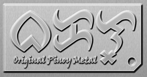
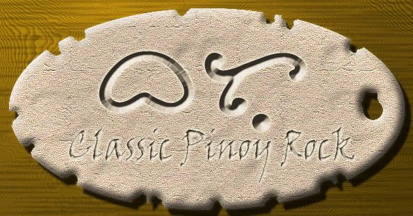
Baybayin Modern Kufic Font
About “KUFIC” style:
Kufic is the oldest calligraphic form of the various Arabic scripts and consists of a modified form of the old Nabatean script. Its name is derived from the city of Kufa (in modern-day Iraq), although it was known in Mesopotamia at least 100 years before the foundation of Kufa. At the time of the emergence of Islam, this type of script was already in use in various parts of the Arabian Peninsula. It was in this script that the first copies of the Qur'an were written.
Why make a Baybayin font in Kufic style?
Why indeed… why not?
Kufic is a very artistic style of Arabic calligraphy. Baybayin Kufic font aims to at least capture some of Kufic’s unsurpassable beauty.
Also…Another reason for creating this font is as a “tongue-in-cheek” response to many comments and misconceptions about Baybayin being of Arabic origin, particularly because of Alibata. The erroneous term "Alibata" (as opposed to Baybayin) was introduced in the early 1900s by Dean Paul Versoza of the University of Manila. He claims the term comes from "alif," "ba," and "ta," the first three letters of the Moro’s (Filipino-Muslim) arrangement of the Arabic letters.
Although Baybayin Script's most probable origins are of India's Hindu influenced Brahmic (Kavi) Script, Baybayin Modern Kufic pays homage to the rich cultural traditions of our Moro brothers and sisters.
The Set:
 Samples of artwork rendered by this font:
The script rendered in green outlined white baybayin kufic font reads: "Ang hindi lumingon sa pinanggalingan, ay hindi makakarating sa paroroonan." (Those who don't look back from where they came from, will never reach their destination.)
A parchment with Baybayin Script in calligraphic Kufic style which reads, "Ang bayan kong Pilipinas, lupain ng ginto at bulaklak." (My homeland Philippines, land of gold and flowers.) - a passage from a popular Tagalog song "Bayan Ko" (My Country).
New Characters & Methods?
Yes and No.
Other than my usual alternatives to "Ra", J, Q, and X; Baybayin Modern Kufic font offers alternative renders of certain characters. I don't want to be accused of blasphemy by purist, so I try my best to remain "traditional" and stick to tried and true forms. You won't hear me introducing new and modified characters or methods unless I have a strong legitimate and valid argument (i.e.. the character "Ra" -
see previous blog entry). I just provide "alternative" styles from certain old character representations and again - if so preferred, there is the option to just use one or just the other. For example, in certain font sets like the kufic font, I provided alternative renderings of Fa ("F" and "f" keys) and Pa (there are also 2 versions of Pa switched by uppercase "P" key and lowercase "p" key) but in essence any and all of these three forms are can by used to represent Pa and/or Fa (phonetically similar in Filipino) syllable.
I've seen some people using kudlits in the shape of a dash, a half moon, a single quote or apostrophe, acute accent, grave accent, caret, etc. - but nothing beats the simple dot. In my case though, in the effort of modernizing the system - I'm trying to introduce (or at least provide an alternative) a system of differentiating or recognizing the hard vowels (i/u) from the soft vowels (e/o) by providing a hard kudlit represented by a solid dot ( ● ) and a soft kudlit represented by a hollow dot ( ○ ). Again, they are available alternatives; if you prefer to be totally traditional, you have the option to just use one or just the other throughout your compositions.
Keystrokes 2, 3, 4, 5, 6 renders special kudlit characters. Normally, it has been recorded as common practice that some writers would double up kudlits to represent repeating similar vowel syllables. For example: Bibi = bi4 ; Bibe = bi3 ; Bobo = bo5 ; Kuko = ku5 ; Also, a new addition to the syllable repeater/doubling method is a modified kudlit, introduced to Nordenx by Filipino artist Sausa (
[link] ). Use keystroke 2 to use the double syllable kudlit. For example: Baba = b2 ; Bibi = bi2 ; Bobo = bo2 . Whith these special kudlits, Baybayin Modern Kufic quickly allows these kudlit combinations: a/a (2), i/i (2), i/e, e/i, e/e (2), o/o (2), o/u, u/o, and u/u (2); but not a/e, a/i, a/o, a/u, e/o, e/u, i/o, i/u, o/e, o/i, u/e, and u/i (due to the top & bottom positions of e/i and o/u preventing a method of sequence). Also, please note that the characters rendered by the ‘, “, *, and – keystrokes are not syllabic kudlits but merely markers and behaves differently (does not position after and on top & bottom of a character).
That's it for now. :)
I'd love to elaborate more about new methods I'd like to introduce. I have more concise information & explanations about my take or suggestions about new practical methods and alternatives of writing Baybayin for modern applications. So much so that I really do plan (in the process of consolidating all the info) by writing a book.
Again, you can download all my fonts at my Deviant Art gallery:
http://nordenx.deviantart.com/
2006 Release:


2007 New Release:
I hope you find some use for them in your art or future tattoos. And don't forget to visit this site too:
http://www.kakaiba.com/ <- Baybayin Store
Until next time...