Showing posts with label Laguna Copperplate Inscription. Show all posts

Saturday, April 20, 2013

LCI Font

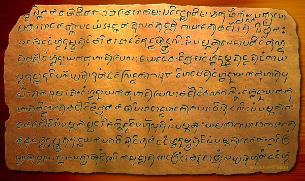
April 21 is the anniversary of the oldest known written artifact from the Philippines, the Laguna Copperplate Inscription (LCI).

Revisit: http://nordenx.blogspot.com/2010/04/lcis-1110th-anniversary.html

I was cleaning out my external backup hard drive when I found the LCI font that I used for writing a section about the copperplate in my manuscript. I really don't know what else to do with this rough & unfinished LCI font other than give it to anyone interested with Old Javanese or Kavi to play around with. So here it is:


A Note of Warning: This font file was never finished, it's still a "rough draft" and it may cause compatibility issues with other baybáyin fonts. Naming conventions and other table settings are not cleaned up. Use it at your own discretion.

Note that the glyph for the "o" marker is partially done and is there, but for some reason it won't show/print into the .pdf file (where the keyboard chart image was taken from). One example of how rough & unfinished this font set is.

Use the chart below for your character/syllable guide.


The glyphs from the LCI are basically Old Javanese/Kavi but with slight irregularities.

...

For more info about the LCI, please read:
Paul Morrow's Page: The Laguna Copperplate Inscription
Hector Santos' Page: A Philippine Leaf
Antoon Postma's Paper: The Laguna Copperplate Inscription: Text and Commentary


...

Friday, August 12, 2011

Mangyan Postma Font

Mr. Antoon Vreeze Postma is a Dutch anthropologist and linguist who has married into and has been living for more than fifty years among the Hanunuo Mangyan tribe in Mindoro, Philippines. He is best known for being the first to decipher the Laguna Copperplate Inscription, and for documenting the Hanunóo script, paving the way for its preservation. He is the founder of the Mangyan Research Center in Panaytayan, Mansalay, Mr. Postma is in charge of the (MHC) Mangyan Heritage Center's research operations. His collection forms the bulk of the materials in the MHC library.

I visited the MHC in my home town of Calapan City, Oriental Mindoro, last year (August 2010). I purchased several of Postma's books and watched how they still use handwriting to record and catalog Ambahan poetry and other learning materials. I showed Mrs. Emily Lorenzo Catapang (Executive Director of MHC) how to instal and use Mangyan fonts on their computers so that they can have a modern alternative way of publishing materials. I promised to continue developing and perfecting fonts for Surat Mangyan for the very purpose of propagating and preserving the written cultural heritage of the Mangyan.

This new font was inspired by Postma's works. Baybayin Mangyan Postma Type has bold and uniform strokes best suited for posters and other print. This font is based on one of Postma's book cover art.

New Mangyan Font:

Download this font set from: http://nordenx.deviantart.com/art/Mangyan-Hanunoo-Postma-Font-252407086
--------------

Mangyan Fonts from 2010:

Download this new font set from: http://nordenx.deviantart.com/art/Mangyan-Hanunoo-Brush-Font-169880405


Download this font set from: http://nordenx.deviantart.com/art/Mangyan-Hanunoo-Font-149145096

--------------
Enhanced by Zemanta

Sunday, April 25, 2010

LCI's 1110th anniversary

"April 21st 2010 marked the 1110th anniversary of the oldest known written artifact from the Philippines, the Laguna Copperplate Inscription (LCI). 1110 years ago on this date (April 21st of the year 900 in our era), the original legal document was written that forgave a debt held by a person living in the general area now occupied by metropolitan Manila." ~ Christopher Miller
Learn more about the Laguna Copperplate Inscription [click here]
Did you know that the LCI contains enough glyphs that fills an almost complete chart for old Javanese/Kavi? The image below contains all the deciphered glyphs found in the LCI:

Though a lot of details & characters are still missing, one only needs to take a look at the parent and related writing systems like Sanskrit and Old Javanese to figure out how rich and complex our ancestor's (proto-baybayin) writing system was prior to the emergence of the more simplistic classical baybayin script.

A couple of features that stand out from the LCI is that the Javanese Srivijaya inhabitants of our pre-colonial archipelago used a virama (vowel cancellation mark), the same function as the cross kudlit except that the LCI virama is only used for a final vowel-less trailing consonant. As for a vowel-less leading consonants, the glyphs form syllables by consonant conjuncts or stacked where the initial glyphs' vowel is dropped; quite similar to other Indic/Brahmic scripts of Hindu inhabitants that co-existed with the Javanese society in the islands at the same era.

We can find glyphs for visarga and anusvāra in the LCI.

An anusvāra is a diacritic used to mark a nasalization used in a number of Indic languages. This eliminated the use of a virama on a nga glyph for that final ng sound.

A visarga is a diacritic used to mark a voiceless breath used in a number of Indic languages. Losing this diacritic may explain the lost 'h' on certain words in modern Tagalog orthography.

Instead of adding a diacritic on the final vowel of a word with a final stress, note that LCI uses a diacritic for a long "a" or ā on the leading syllable's glyph.

Along with the long ā, the LCI shows us that the ancient islanders have all of the markers needed for five vowel sounds plus another for "ai" and a simple and modern-like "period" punctuation mark.

Note the characters for "ra", "ja", and "sha"; nevermind the "ca" and "ña" - wonder why these glyphs from Kawi did not carry through to baybayin? Sanskrit (parent script for both baybayin and kawi) also has these phonemes covered. One has to ponder when, how, and why our spoken language changed so much that the letters for these sounds are dropped from our spoken & written language. What happened between the time of the LCI until the re-introduction of letters and matching phonemes after the arrival of westerners? A proto-baybayin script may have been developed by the people for their own social class' usage by emulating features of Old Kawi and Sanskrit (that were propriety to the ruling & religious class). If this is the case, then the disparity and disconnect between social classes already existed in our ancient society even before western corruption entered the scene.

The few examples of alternate or modified sub-scripted and super-scripted character glyphs and those that form character conjuncts are surprisingly varied and complex (like those of "ra" and "ya"), I wouldn't be surprised that there are more letter combinations that are possible but not recorded in the LCI; other artifacts with Kawi from outside of the Philippines could fill in those gaps. For more examples and info, see: Aksara Kawi or Omniglot.

.

*edit - Additional Info:
Note that the LCI glyphs are Old Javanese Kawi Script with just a few peculiar character variations. This is probably due to the way the characters on the Laguna plate seemed to have been hammered into cold copper instead of the characters being impressed into heated copper which was the norm in Java at the time.

Also, the language used in the Laguna Copperplate Inscription is a variety of Old Malay containing numerous loanwords from Sanskrit and a few non-Malay vocabulary elements from Old Javanese and Old Tagalog (Austronesian).

Other artifacts of interest:
* Kedukan Bukit Inscription
* Tanjong Tanah Code of Law

Resources:
Many thanks to Antoon Postma, Dr. Johann de Casparis, Hector Santos, Paul Morrow for sharing their translations and research about the LCI.

Thanks to linguist and SEA script expert Christopher Miller (Kiwehtin) for providing additional info (please read comments) and visit Tyro Blog.

Monday, January 11, 2010

On your mark, get set, xo! The great baybayin kudlit race begins.

Slit, slash, dot, dot, dit, dit, XOXO, LOL! It may sound funny to you but it's no laughing matter.

XOXOXO
Different styles of kudlit marks.

Cross "Kudlit" - Ang kulit n'yo!

Ever since the Spanish priest Fr. Francisco Lopez introduced the cross-shaped kudlit back in 1620 for the Ilocano printing of Doctrina Cristiana, we have been at odds with "reform". Whether it's truly a matter of principle, or protest, or stubbornness, the two camps of baybáyin practitioners (traditionalists and reformists) need to find a middle ground. While the first two reasons (principle & protest) are reasonable personal choice/preference, the stubborn ones are quite beyond reason.

While some baybayin practitioners might say that the Spaniards (Lopez) "invented" the cross kudlit just to convert more natives into Christianity, that is hearsay (or should I say "heresy"? (sic, pun)). It is true though that the Doctrina Cristiana books were published to take advantage of the native people's literacy. However, the motivation for the friars to "reform" baybáyin script for legibility has its merit in modern typography. The decision to include a baybayin version of the virama (vowel cancellation mark) is not just a spur of the moment "invention" but it is more likely based on a careful study of linguistics by scholars (who happen to also be friars) at the time. Other writing methods (Abugida) related to or predecessors of baybayin have vowel cancellation marks or systems, so adopting a similar system is not entirely unreasonable. Note also that the kavi script in the Laguna Copperplate Inscriptions (LCI), which is dated back to 900CE, used both virama and ligatured glyphs to cancel vowel sounds similar to the methods of other Brahmic scripts and also what is currently being developed for the Súlat Kapampángan version of baybáyin.


A cleaned-up illustration of the Laguna Copperplate inscription

The virama for Tagalog Baybáyin was rejected by natives because they considered the script adequate without it. While that works well for their need at the time, the Filipino languages' lexicon has grown dramatically since then. The need for a virama becomes apparent even when writing the most mundane notes:

Correction on top image: Typo "you're" was supposed to be "you".

When asked to read the sentence above, written in traditional "no dead consonants" method, the most common response was: "bayag mo'y maliit dahil sa utin ng itim na malaki", which means: "your balls are small (shrunk) because of (seeing) the black guy's big organ". Imagine the confusion at a duck farm in Pateros. Incited after a client ordered several breeding pairs of ducks and he received this note along with his bill? When all the poor farmer wanted to convey is, "bayad mo'y maliit dahil sa unti ng itik na malaki", meaning, "your bill is small because we are short on adult itik ducks". The farmer, just wanting to make up for the incomplete order by giving his client a discount, unwittingly conveyed the wrong message.

Whatever your qualms are about the cross kudlit, for baybáyin to be useful in writing normal correspondence these days, the virama is a practical approach. Even the Mangyan "pamudpod" mark, introduced by Dutch anthropologist Antoon Postma, has been better received and is used by the Hanunóo. While the Kapampangan method of vowel cancellation is proving quite useful for both modern & traditional artistic design; although it has its limitations when it comes to modern typography (typing in a word processor and publication) and creating standardized fonts. For arts and crafts, tradition is fine. But for common use like signage and publishing, the virama is important. I say, learn to use both methods and teach both methods. Use whichever method is appropriate for the composition at hand.

Kulitan blues continues!

Crescents, and dashes, and dots, oh my! So many stylistic takes on the kudlit markers! I don't really mind at all, even I do them differently from time to time depending on the style of the characters I am creating or writing. The problem arises when artists and font designers develop or stylize separate marks for soft and hard vowels e/o and i/u respectively, where crescents are flipped, dashes angled differently, and dots become hollow and solid. I don't discourage the practice (I also do it), but I want people to think about ease of legibility especially when designing fonts.

Don't get me started on coming up with new punctuation marks and numbers! ...that's another blog topic. ;)